Silhouette ArtTitle:
Medium: Acrylic on Canvas Size: 30.48x30.48cm Exhibition Text:
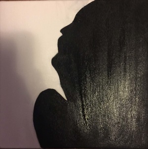
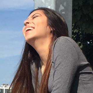
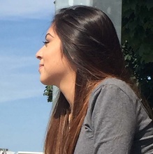
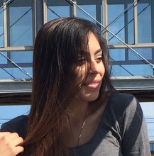
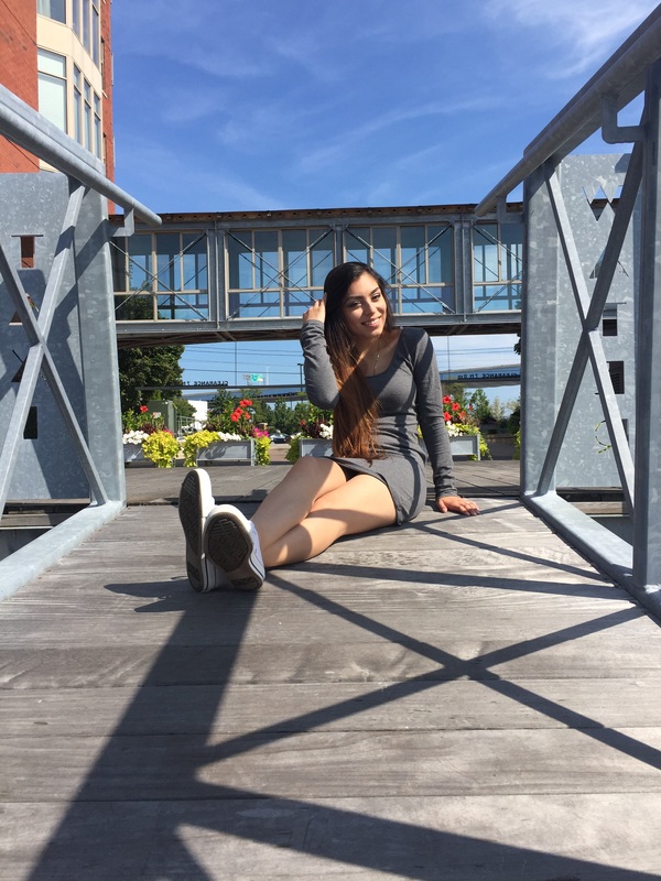
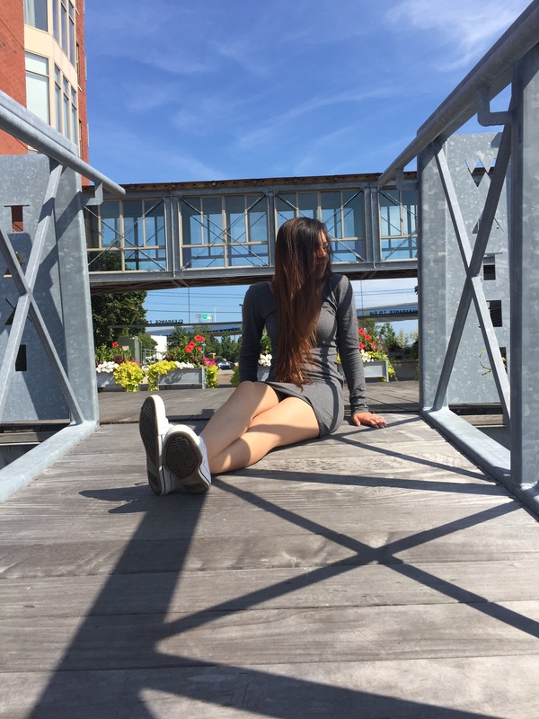
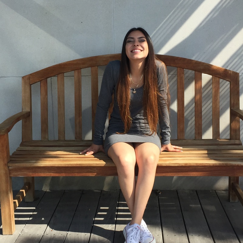
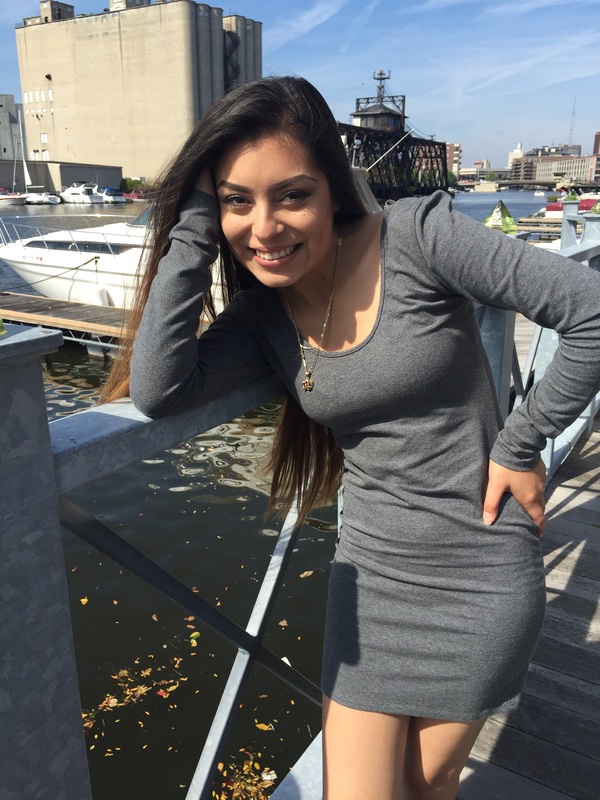
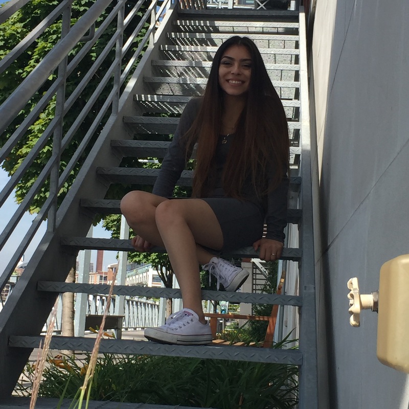
My original intention for this artwork was to have a self portrait, using as an inspiration a photograph of myself. I decided to choose a photograph where I was facing sideways to mimic the original idea of a silhouette. I also decided to choose this photograph as inspiration for this piece because it is one where the camera caught me laughing. My intention with this piece was to create a silhouette that was modern with a hint of myself meaning that I wanted to show that I can smile and be happy for the most part, but I there’s also an opposite side. I was influenced to create this piece by Cindi Harwood Rose because she was the most popular artist I found information on. Also because she put quite some effort in her own artwork for not a single one to look like another. The medium used for this piece was acrylic on canvas. |
|
|
|
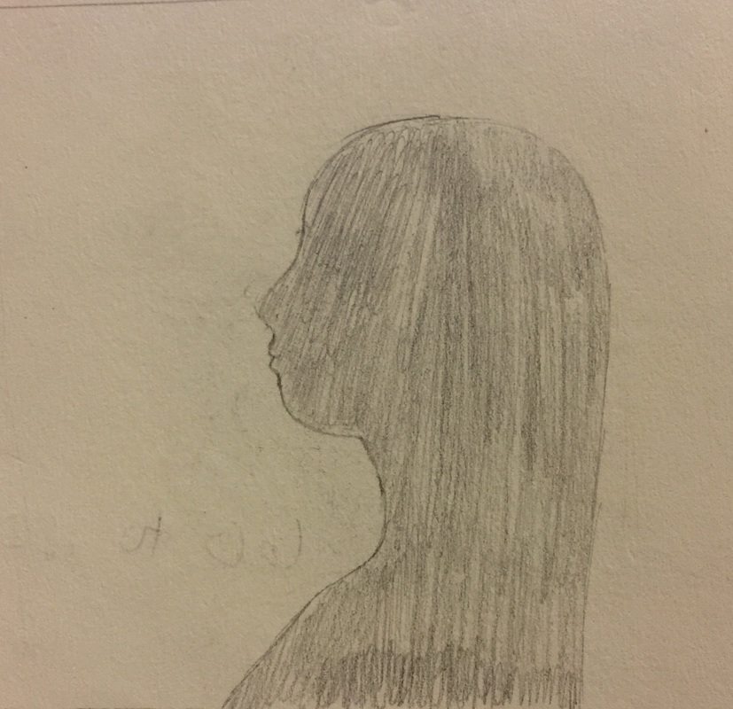
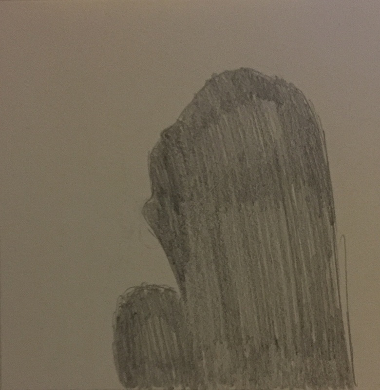
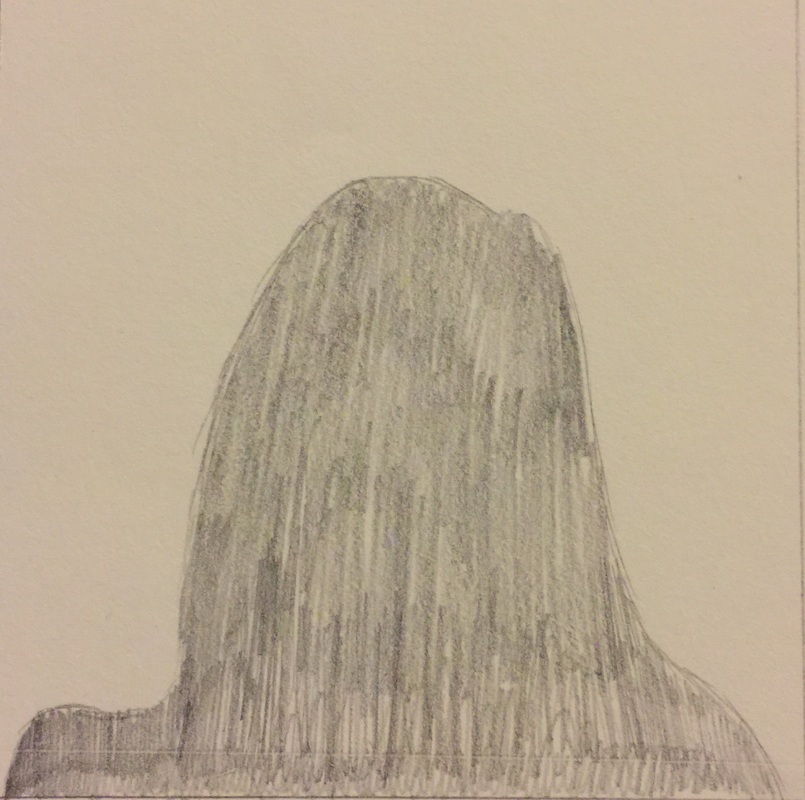
These are my simple sketches for ideas that I came up with for this silhouette piece. They are created in the pencil media which allowed me to quickly and efficiently create these sketches. I used a total of three photographs as inspiration for three of these sketches.
|

|
History of Silhouette Art:
A silhouette is the image of a person, animal or any other object that is represented in a solid shape and in a single color. Before photography silhouettes were a form on portraiture. These were a way to have a profile portrait made without having to pay for an expensive portrait. The interior of a silhouette is typically featureless. These were very inexpensive because the artist did not have to add any of the facial features of the model. Silhouettes also began with the artist cutting a piece of paper to form the shape of the model. Most people framed these back then. They became very popular in the mid-18th century. Silhouette Art Inspiration: My inspiration for this piece was Cindi Harwood Rose. She has the ability to free hand without using a pen or pencil. I was inspired by her because at events she can cut over 60 to 100 silhouettes per hour. No two silhouettes of hers look alike. I decided to use the acrylic on canvas medium because I didn't want to completely mock her technique. I did not feel like I had the ability to cut a silhouette as well as she did. I also used photographs as inspiration to give myself an idea of what to create. |
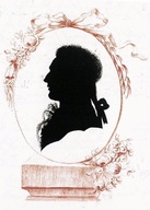
This is a traditional silhouette from the 18th century.
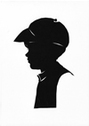
An example of one of Cindi's silhouettes.
|
Photoshop Piece
|
Title:
Medium: Digital Manipulation Size: 27.6352 cm x 20.7264cm Exhibition Text:
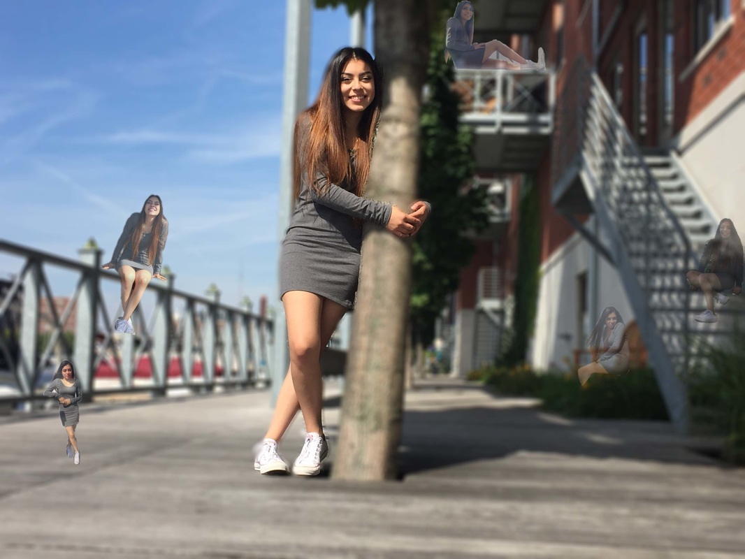
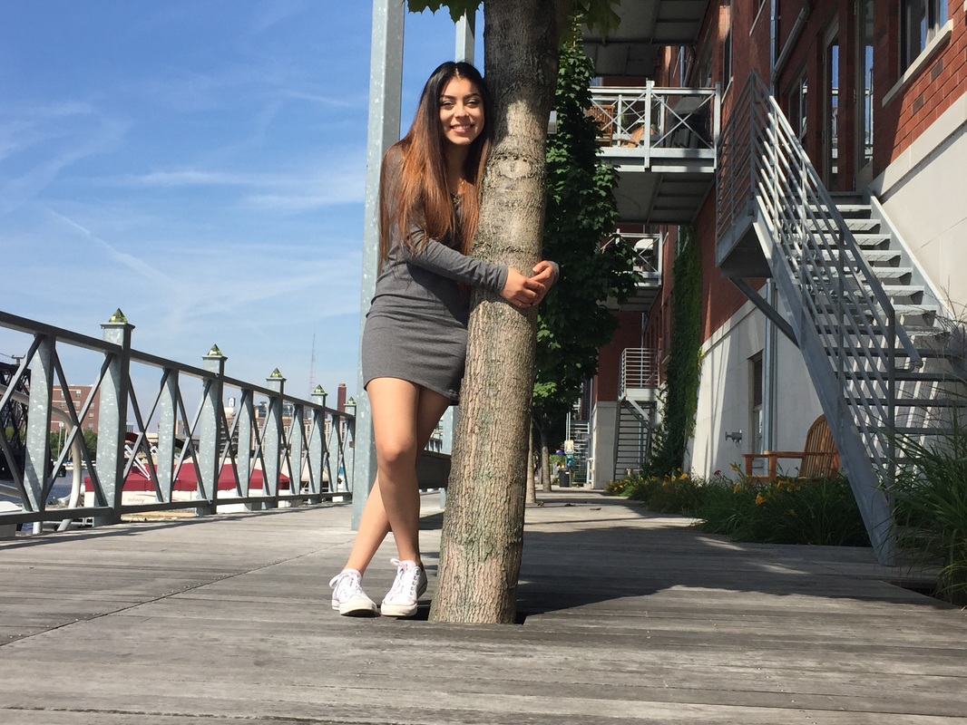
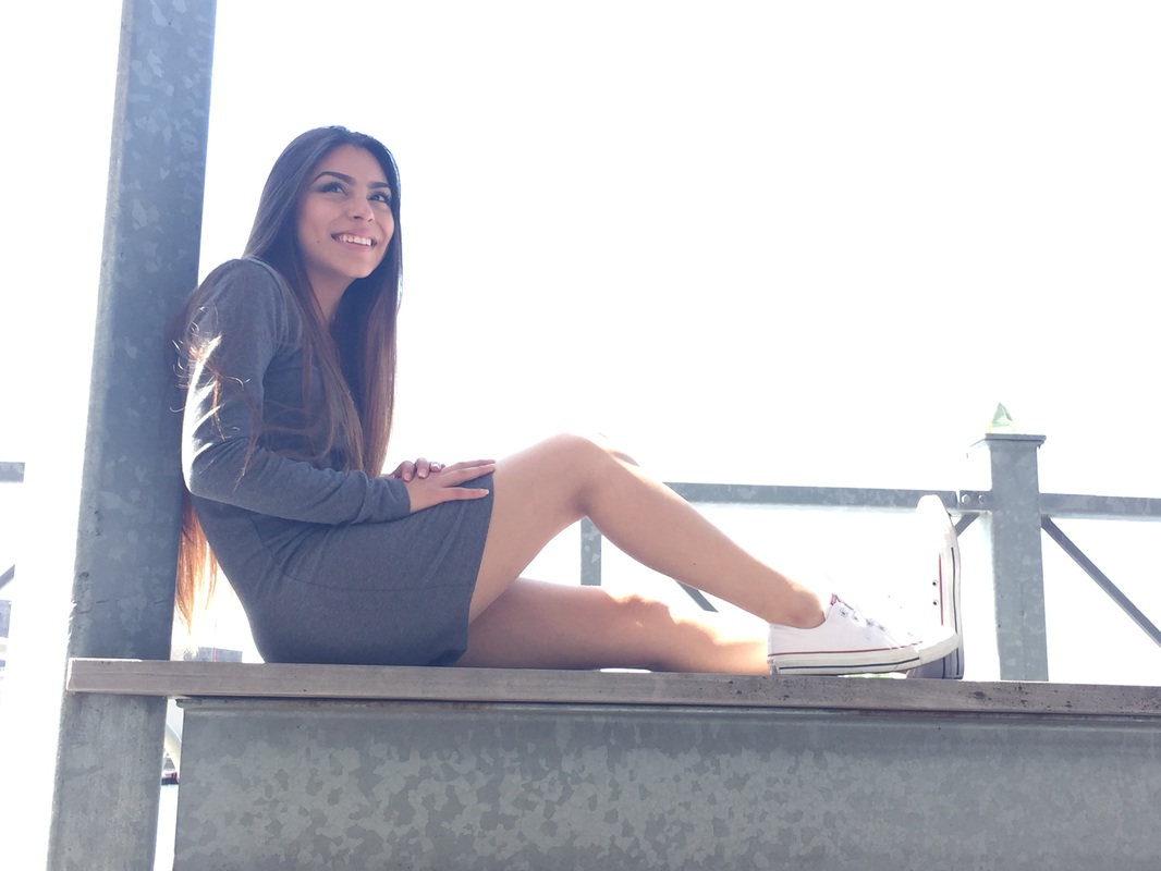
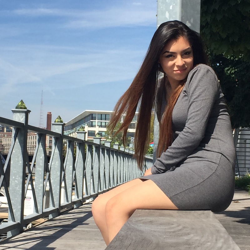
These are the photographs that I used to create my Photoshop piece.
These are photographs that were not taken professionally. The whole point of these photographs was to have multiple poses to be able to produce a Surrealist piece. With the inspiration of a surrealist piece it was my intention to show the audience personal emotion through the several facial expressions that were demonstrated. Artist Inspiration: My inspiration for this piece was Raining Men by Rene Magritte. I was inspired by this piece because I wanted to create a piece of surrealist art. I wanted a piece that would create disturbance towards the audience. Just as Rene Magritte, I aimed to place an object in odd situations. In this case the object was myself. I used photographs that were taken for my senior portraits. Not all of the photographs that were taken were pieces that I would normally show to anyone. The facial expressions I decided to show here were to show the audience a deeper part of me. I wanted to create a connection between them so that they would feel as if there was a connection between us. |
|
|
Process:
Here are a few screenshots of the process of my piece. I used digital manipulation to create every single one of these pieces. For the most part I selected myself from several pictures and copied it over to the first photograph that is used as the background. I adjusted the opacity of each piece i pasted to create the illusion I desired. |
|
Choice Piece
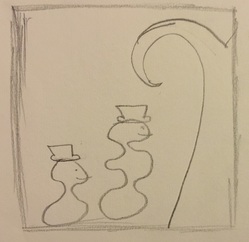
This is the sketch for my piece.
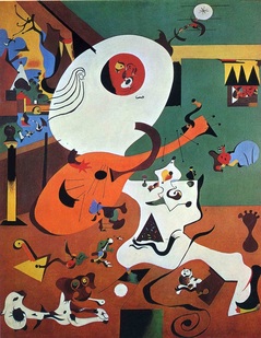
Dutch Interior I by Joan Miro.
|
Title:
Medium: Acrylic on Canvas Size: 60.96cm x 60.96 cm Exhibition Text:
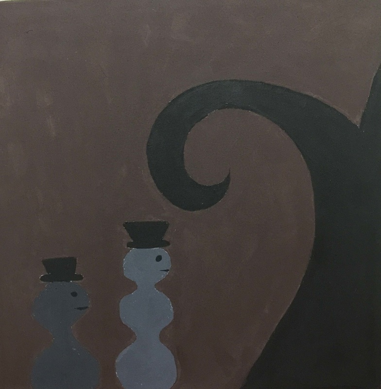
My original intention for this piece was to show a glimpse of a play that I read in my IB Literature class. The name of this play is Waiting for Godot. Both characters seemed to be waiting for something or someone that was never going to arrive. Artist Inspiration: My artist inspiration was Joan Miro. I was inspired by both pieces Dutch Interior 1 and Dutch Interior 2. I was inspired by how his pieces were spontaneously created. He used almost semi-abstract forms to represent common items. I created both characters in a simple abstract form to demonstrate how simple the characters in the play are. I also added the tree to the painting because it was also a simple object from the play. It was also meaningless and very noticeable. This piece was a canvas of improvised art. It created a different surrealist view to the audience. Process: The first step of the process was to read the play Waiting for Godot by Samuel Beckett. The following step was to create a sketch of the piece I wanted to create. After that I drew out the sketch on the canvas. As soon as I did that I began to use acrylic paint to paint the piece. 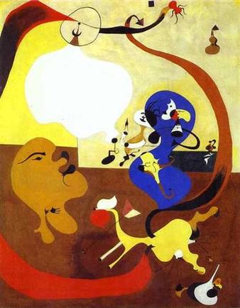
Dutch Interior II by Joan Miro.
|
Choice Piece
|
Title:
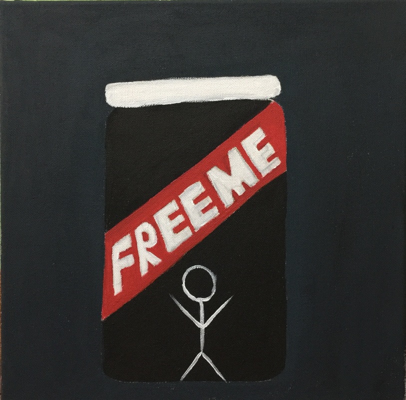
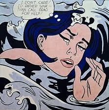
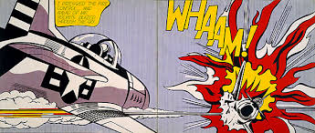
Medium: Acrylic on Canvas Size: 30.48x30.48cm Exhibition Text: My original intention for this piece was to create a piece that was inspired by both pop art and modern art. I wanted to create this piece to express how someone, a person whom is pure feels trapped in a dark glass jar. The only way out of this life is making their way out through the white cap. The white cap symbolizes the freedom they crave. Artist Inspiration: There were two artist inspirations for this piece. One of them was Roy Lichtenstein. A couple of his pieces that I was inspired by were The Drowning Girl, as well as Whaam! I was inspired by both these pieces because of the color scheme of them. By this I mean that the colors were so simple and bold. They don't seem to have had much work put into them. It was art that was created mindlessly.
My second artist inspiration was Barbara Krueger. I was inspired by Krueger because I really liked her idea of the bold words right in the center of her photographs. I found this as a way to express a message to the audience. I was mainly inspired by her piece titled Your Body is a Battleground. One of the elements of this piece that caught my attention and i wanted to recreate was the red banner with bold white letters.
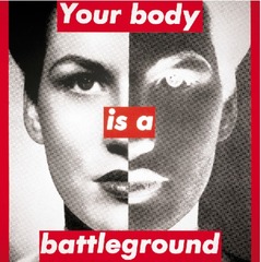
Your Body is a Battleground by Barbara Krueger.
|
Process:
To start off the process for this piece I sketched out what I wanted my canvas to look like. Below is the sketch that I created once I came up with the idea. 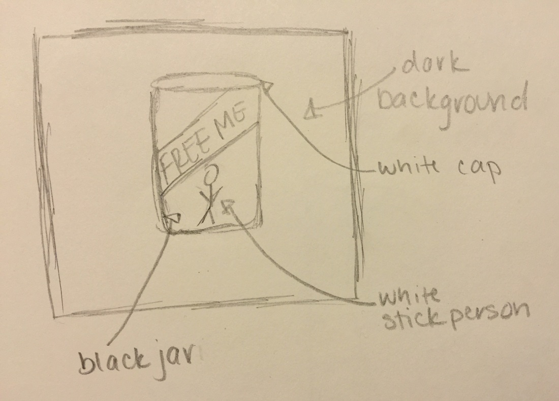
Following that I sketched out my idea onto my 2 foot by 2 foot canvas. Then I selected the colors I wanted to use to create my piece. I picked bold colors that would stand out as well as they would go with the concept of my idea. And finally, I began to paint my piece in acrylic paint.
|
Choice Piece
|
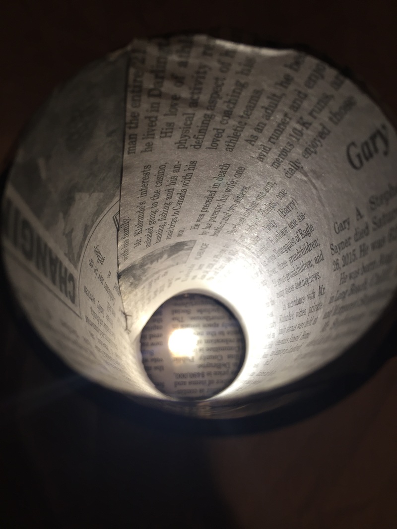
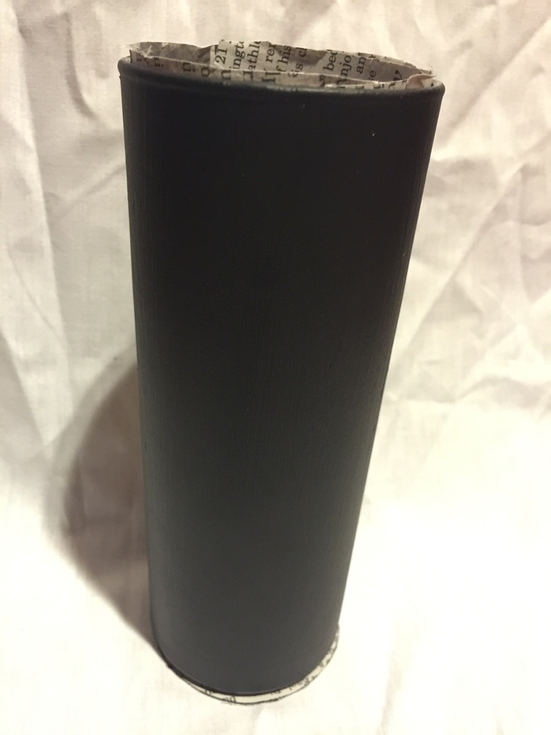
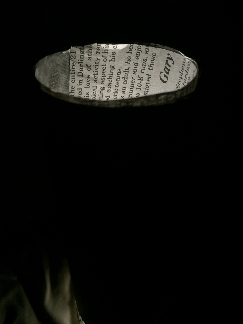
Title:
Medium: Found object Size: Exhibition Text: My original intention for this piece was to create a part two, or something that would connect to my previous piece. This piece represents the light, that symbolizes a person, trying to leave the darkness of being criticized by others. They are also tired of growing with the news that's going on around the world as well as the materialistic and irrelevant things that most of the population in the world is now worried about. They want to escape, but the darkness is not allowing them to do so. Artist Inspiration: For this piece I was inspired by Kathe Kollowitz. I was inspired by her German Expressionist art because of how dark her pieces were. With this piece I wanted to represent the light wanting to bleed through the darkness.I decided to use German Expressionism as my inspiration because these artists used forms and colors for emotional impact. My piece gives off a dark and emotional impact with the colors that were used. A specific piece I was inspired by was the following. 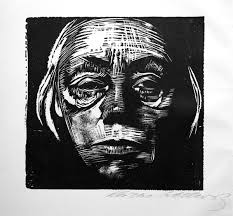
Self-Portrait by Kathe KollowitzI was inspired by this piece because Kollowitz used stark forms and harsh lines to express the tragic loss in war's aftermath.
|
Process:
To begin the process for this piece I had to come up with an idea of what I wanted to create. I decided to create something that would connect to my previous piece. I sketched out an idea that instantly came to me. 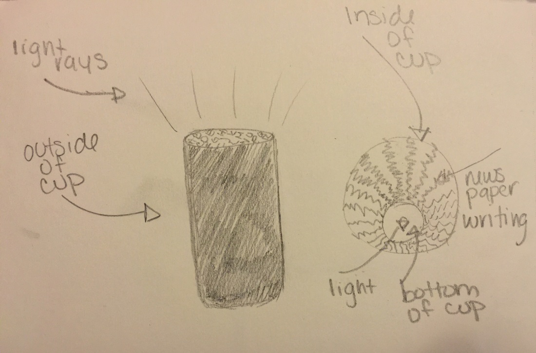
This is the sketch that I created for this piece. After the sketch i gathered materials I needed such as acrylic paint, a glass cup, news paper, flashlight, and a pair of scissors. I first cut out a piece of newspaper to fit the circumference of the glass cup as well as the area of the bottom section of it. Following that I painted the outside of the cup with acrylic black paint. After completing that and letting it dry for a couple of hours I placed the newspaper both in the circumference of the cup and the bottom of it. And lastly, I placed a light source right on the center of the inside of the cup.
|